Year
Tools
As the sole designer, I led the complete redesign of DexHunter - a Web3 trading aggregator built around real-time analytics and multi-exchange integration.
The previous interface was overloaded and inconsistent, so my goal was to rebuild it from the ground up: simplify user flows, improve transparency of data, and create a unified dark-themed design system that could scale efficiently across new product modules.

I redesigned all key product areas - trading, token analytics, swap module, and trending dashboards - ensuring clear hierarchy and seamless transitions between views.
A new component library and variable-based system streamlined design-to-dev collaboration, reducing implementation time and improving consistency across desktop and mobile.
Collaboration with the PM and engineering team helped validate usability and align on performance goals, while maintaining the product’s technical depth and visual precision.
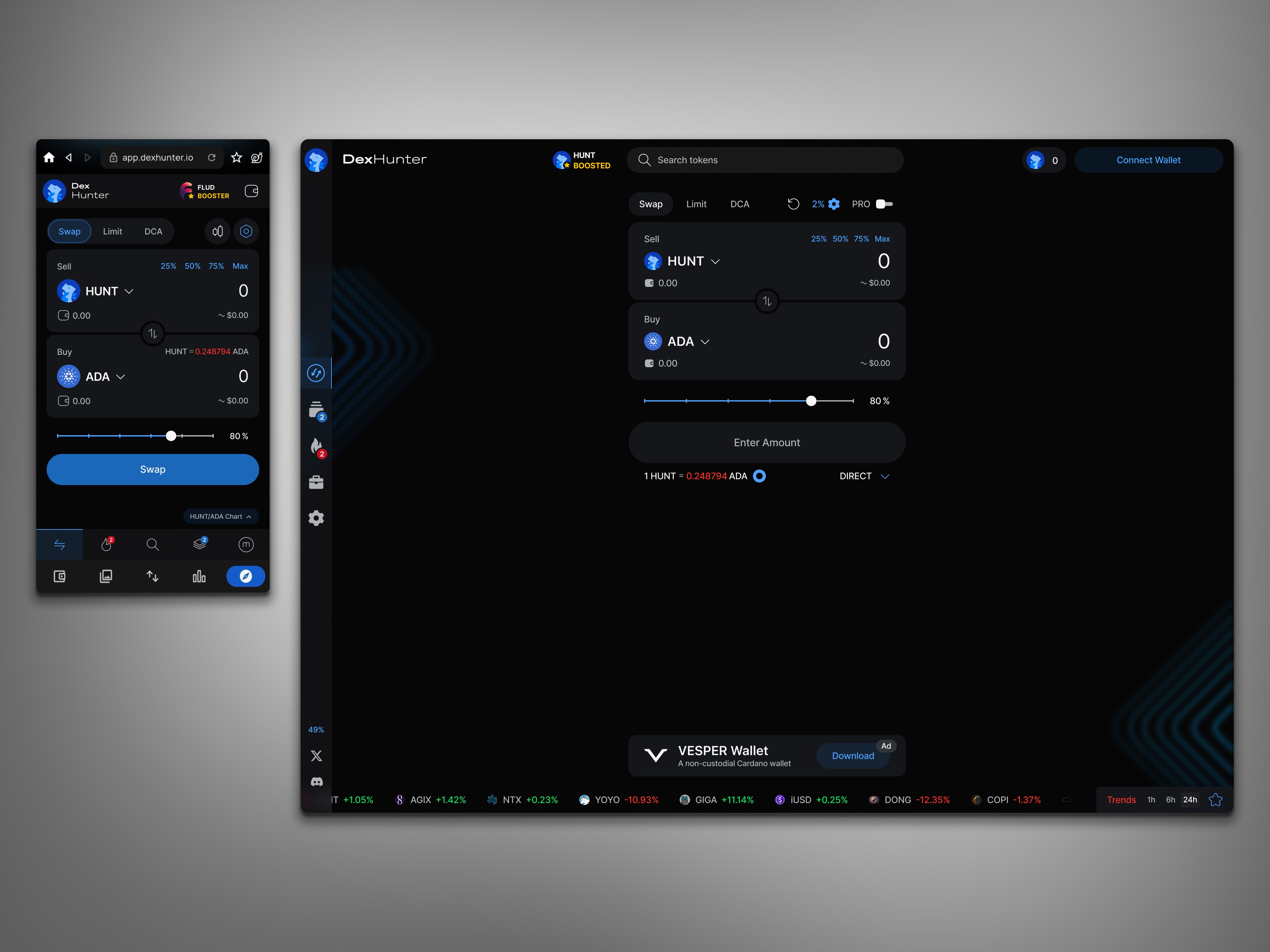
Redesigned token swap flow with clear hierarchy and cross-device consistency.
Simplified complex DeFi interactions into a clean, accessible layout, improving user focus and reducing friction across desktop and mobile.
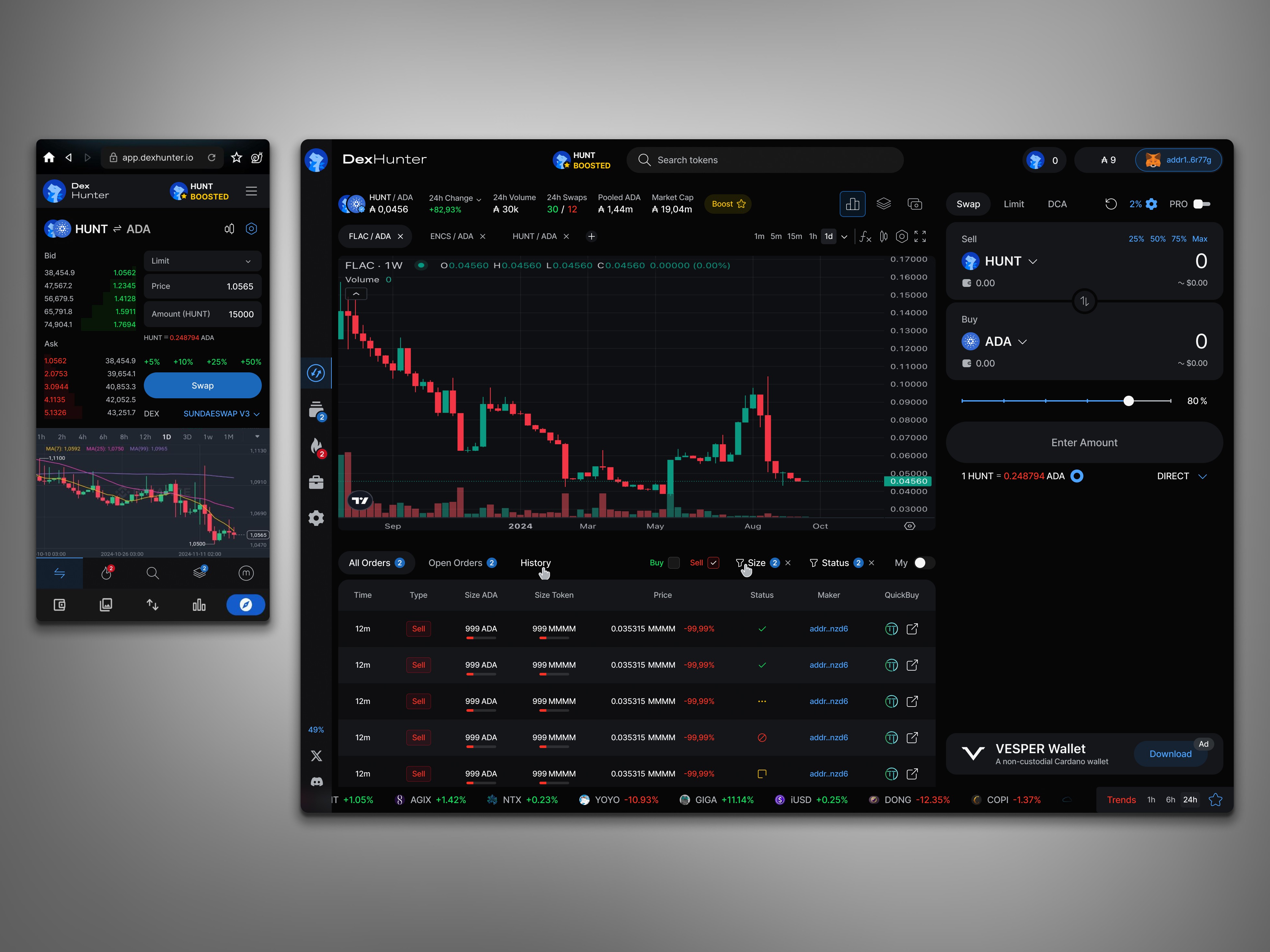
Redesigned trading interface with improved data hierarchy and usability.
Organized charts, order book, and trade history into a cohesive layout that enhances focus, supports fast decision-making, and maintains clarity in dense data views.

Designed data-driven dashboards for trending tokens and market insights.
Structured complex analytics into clear visual modules, making performance data and token trends easily scannable across desktop and mobile.
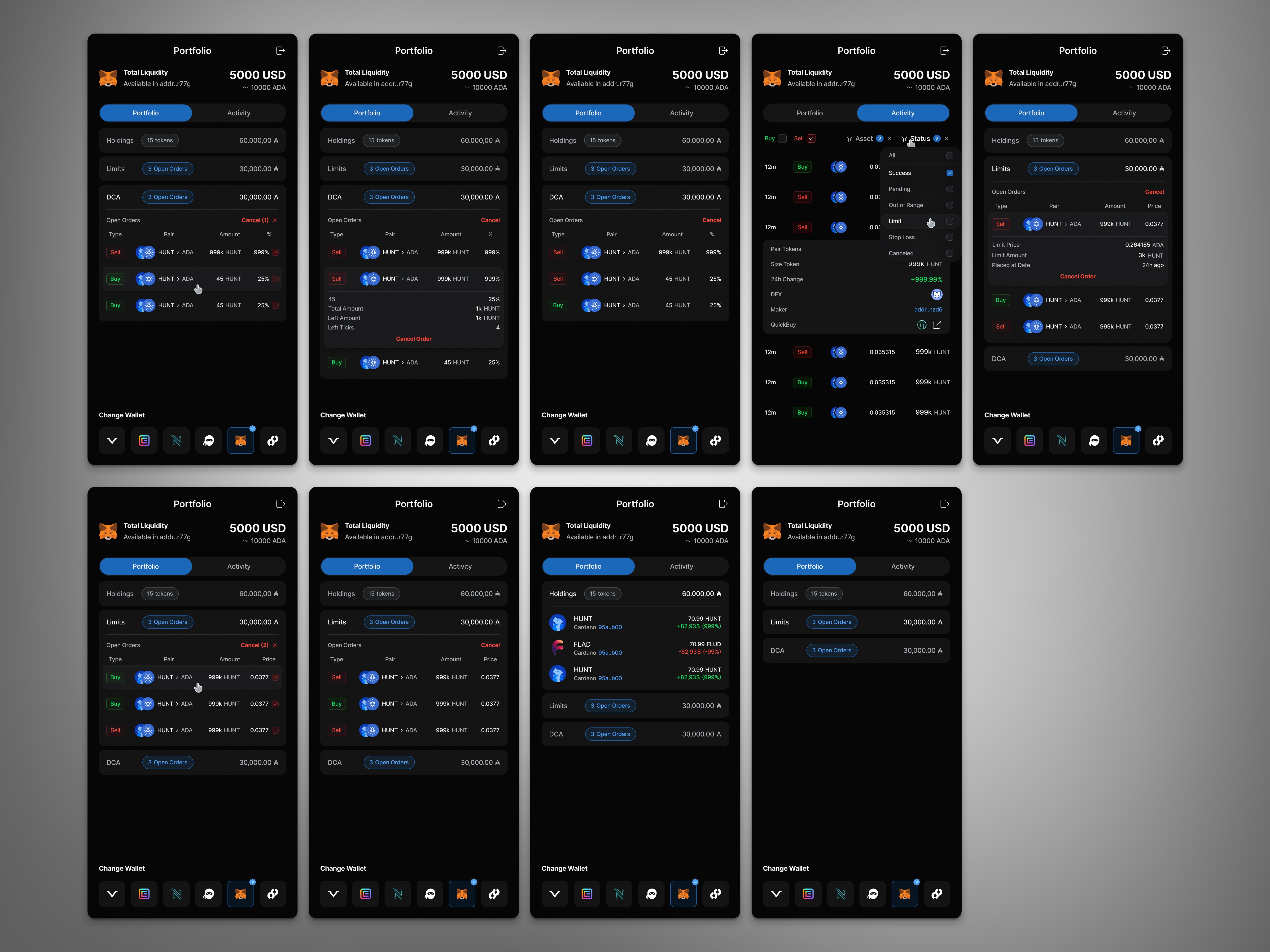
Portfolio Module - Full UX Coverage
Designed and validated every portfolio interaction and state, covering holdings, limits, DCA, and activity for a seamless user experience.
To validate the redesign, we conducted internal user testing and conversion analysis:
Task completion time improved by 20 %, reflecting clearer flow structure.
Conversion rates increased during beta rollout due to simplified interaction logic.
Retention rate rose in follow-up tests, confirming improved readability and trust.
Developers reported faster implementation and fewer design clarifications thanks to the structured design system and variable naming.
Together, these results confirmed that the redesign achieved its main goals - clarity, usability, and scalability.
Outcomes
Delivered a full-scale redesign with a cohesive dark-themed design system
Created over 60 reusable components with consistent interaction logic
Simplified trading and analytics flows for both desktop and mobile users
Enabled faster development cycles and stronger alignment between design and engineering


