Year
Tools
AussiedlerBote is a digital news platform covering German politics, immigration, and social issues. I was responsible for a full redesign of the website, from homepage and article layout to typography, spacing, and ad placements.
The client requested a modern, structured look inspired by The New York Times, but tailored to a more general audience. I brought in clarity and rhythm to the layouts while increasing information density - without compromising readability.
To support development, I also built a clean design system with typography & color tokens, reusable card components, and consistent naming logic. The final result was accepted instantly, with no revisions required.

The client came with a clear goal: modernize the platform while keeping the credibility of traditional newspapers. I researched industry-leading outlets like NYT and BBC, and used them as references to guide structure, spacing, and tone.
I condensed content density without overwhelming the user - adding scannable metadata (author, read time, categories) and clear visual hierarchy. The interface now fits more news per screen, while remaining accessible across devices.
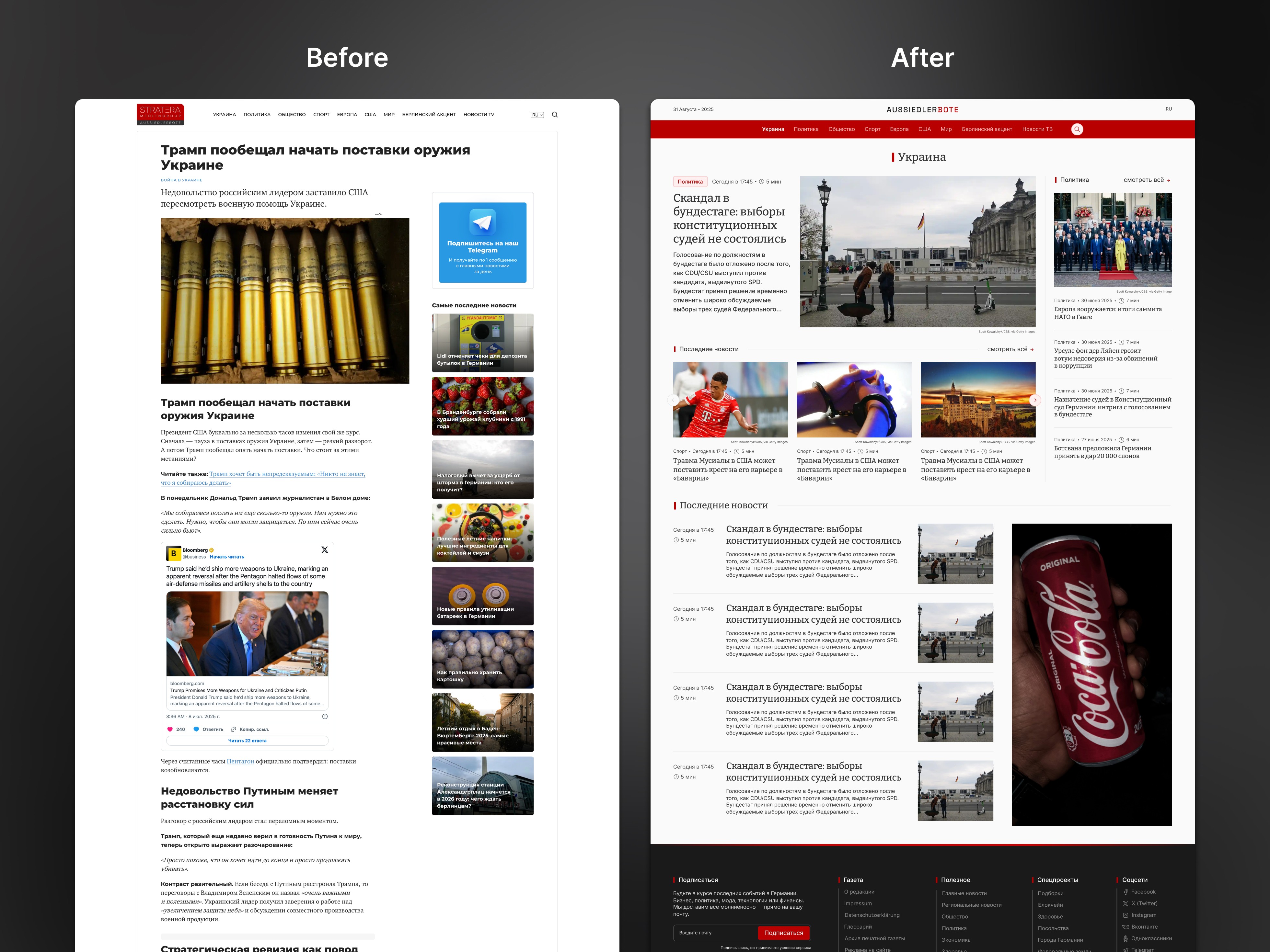
Alongside layout improvements, I integrated banner ad zones into the flow, ensuring visibility without disrupting the reading experience - a key client requirement.
The entire redesign was accepted without a single revision. This project highlights my ability to combine editorial structure, modern UX principles, and client goals into a unified system.
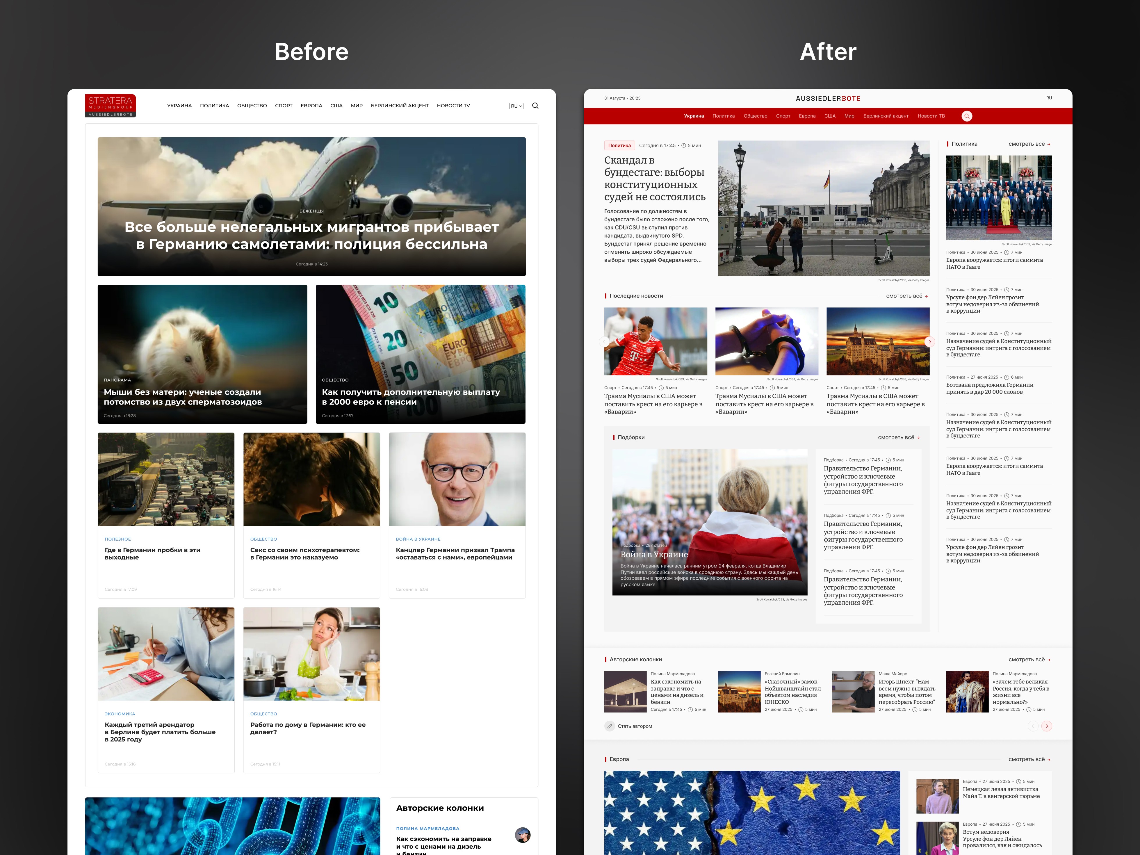
Redesigned homepage for clarity, density, and editorial rhythm.
Modernized layout inspired by leading newspapers - more stories per screen, with readable metadata and integrated ad slots.
Redesigned category page with improved layout and monetization support.
Introduced a more structured, scannable layout with better content density and integrated ad slots - helping users stay informed while supporting business goals.
Success Validation
Conducted usability testing that confirmed improved readability and navigation speed across desktop, tablet, and mobile layouts.
Readers spent more time engaging with content due to better typographic hierarchy and balanced spacing.
Simplified category navigation reduced time-to-article and improved discoverability of related stories.
Internal editorial feedback highlighted easier content placement and better visual alignment of article blocks.
Outcomes
Delivered a modern, reader-focused news platform with adaptive layouts and enhanced legibility.
Improved information hierarchy and made long-form reading more comfortable across devices.
Developed a scalable, CMS-friendly structure that supports fast content updates and consistent visual rhythm.
Strengthened the overall user experience through thoughtful typography, spacing, and modular design logic.


