Year
Tools
Web3 trading and governance platform built for the Cardano community.
As the sole Product Designer on the SnekFun project, I was responsible for the complete design process - from UX logic and data-heavy dashboards to the creation of a scalable multi-theme design system.
SnekFun is a Web3 platform that combines trading, governance, and gamified community mechanics. My goal was to create a clear and consistent interface for a product that handles complex real-time data while staying approachable for users with different levels of crypto experience.

The work included defining UX flows, interface architecture, and visual consistency across multiple themes (light, dark, and seasonal).
I designed over 80 reusable components, improved readability in data-dense environments, and built a modular system that allows the team to scale new features quickly.
Collaboration with developers ensured smooth implementation from Figma to production, maintaining both usability and brand identity throughout the product.

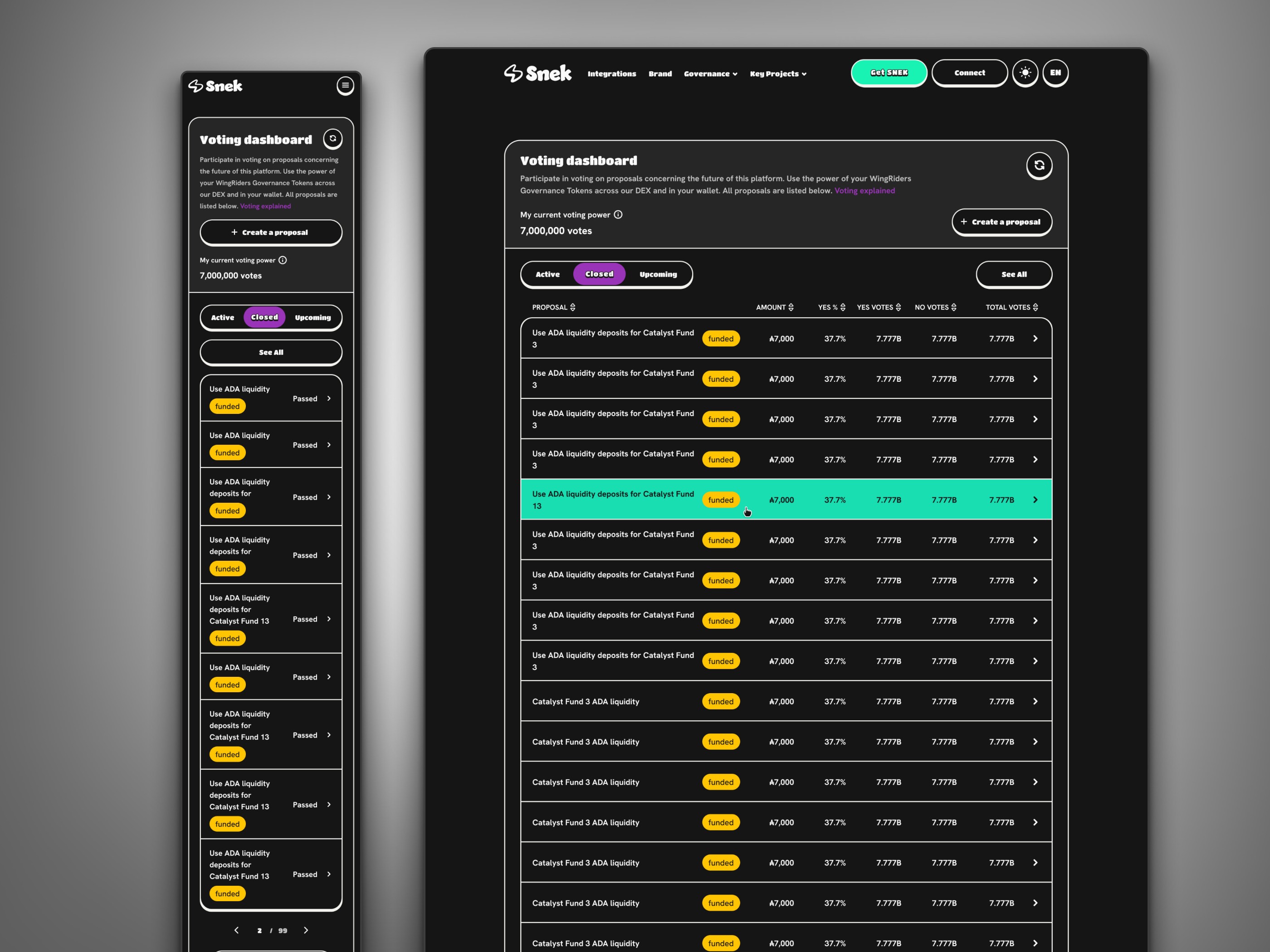
Light Theme - Data Hierarchy & Readability
Demonstrated how dense data can be structured into a clear, scannable layout using contrast, spacing, and hierarchy.
Dark Theme - Accessibility in Data-Heavy Views
Applied optimized contrast and spacing to keep analytics readable and visually balanced in dark mode.
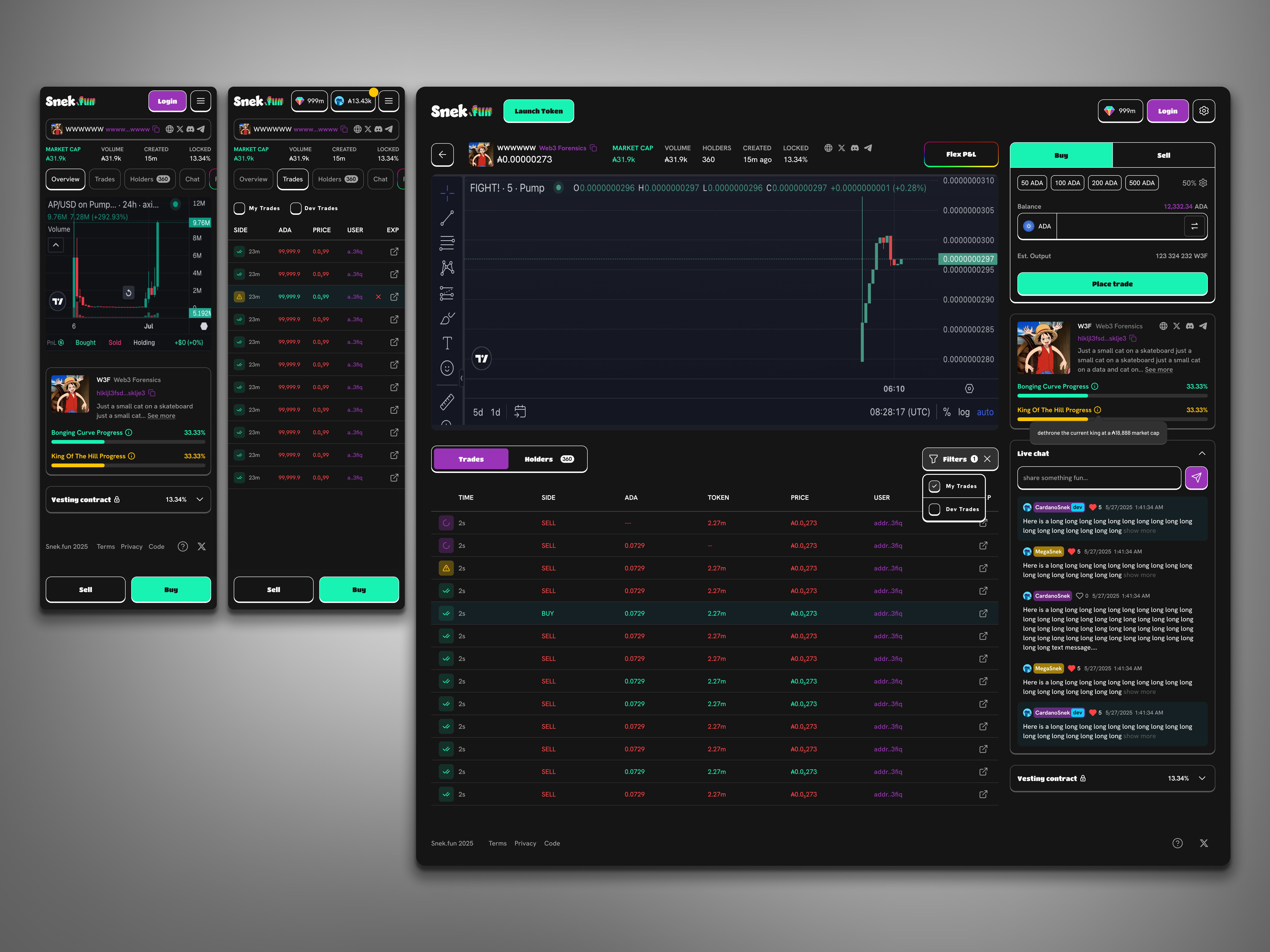
Real-time trading dashboard combining analytics, charts, and community interactions.
Designed for clarity and performance within data-dense layouts while maintaining a cohesive visual logic across modules.
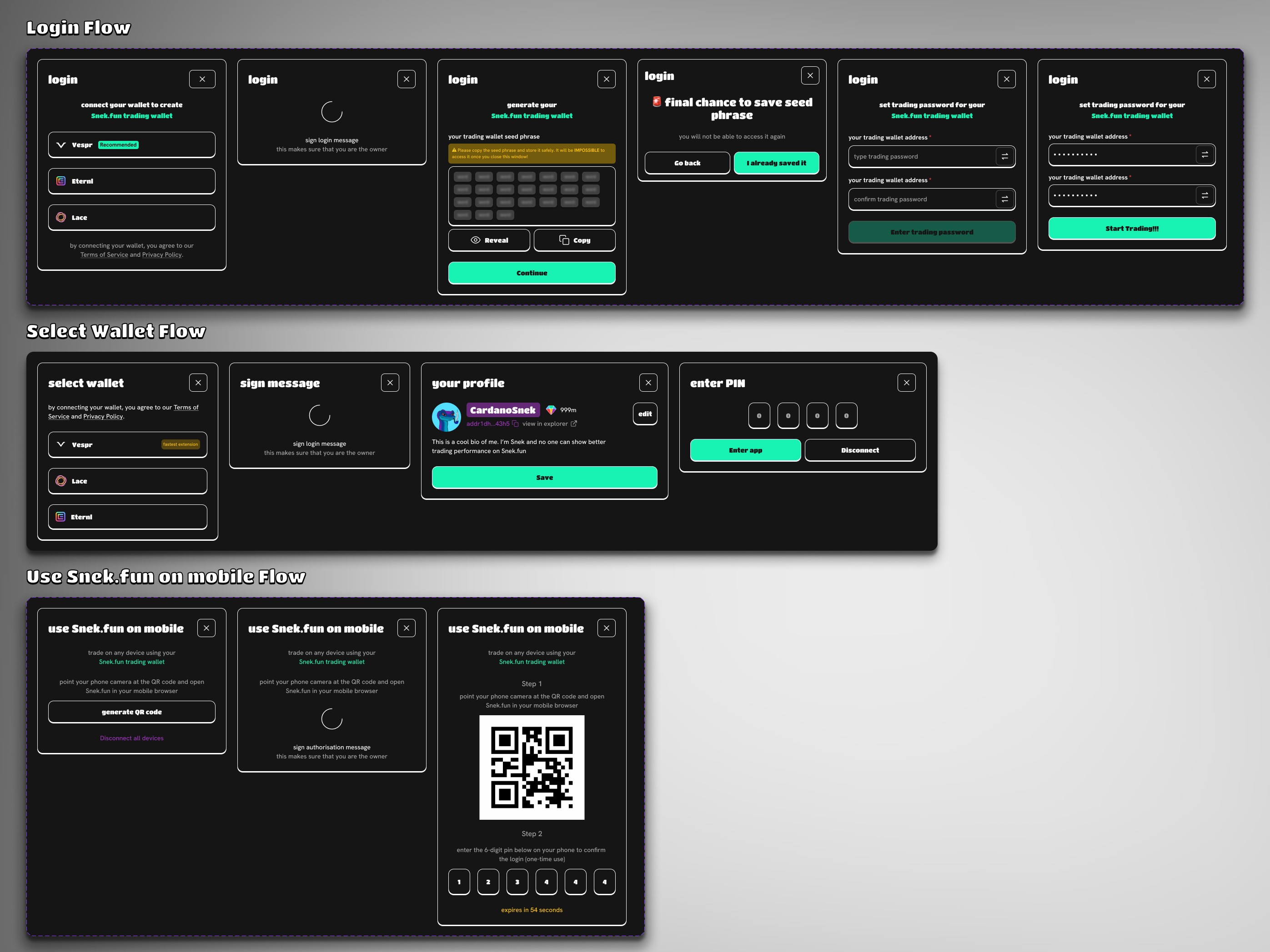
Example of detailed UX flows created for SnekFun.
As part of the SnekFun project, I designed not only the UI and design system but also detailed user flows - such as login, wallet connection, and mobile pairing.
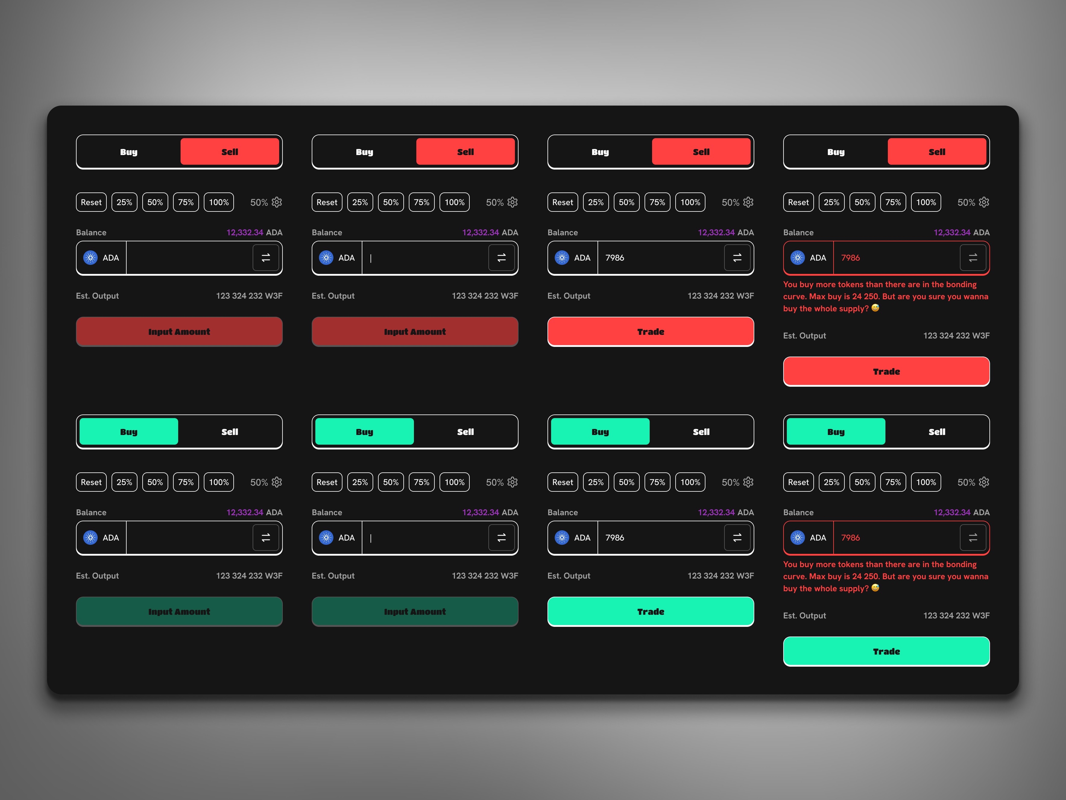
One of the edge cases explored during trading flow design.
Demonstrates how different input and action states - such as empty, active, and error scenarios - were considered to ensure clarity and prevent user mistakes.
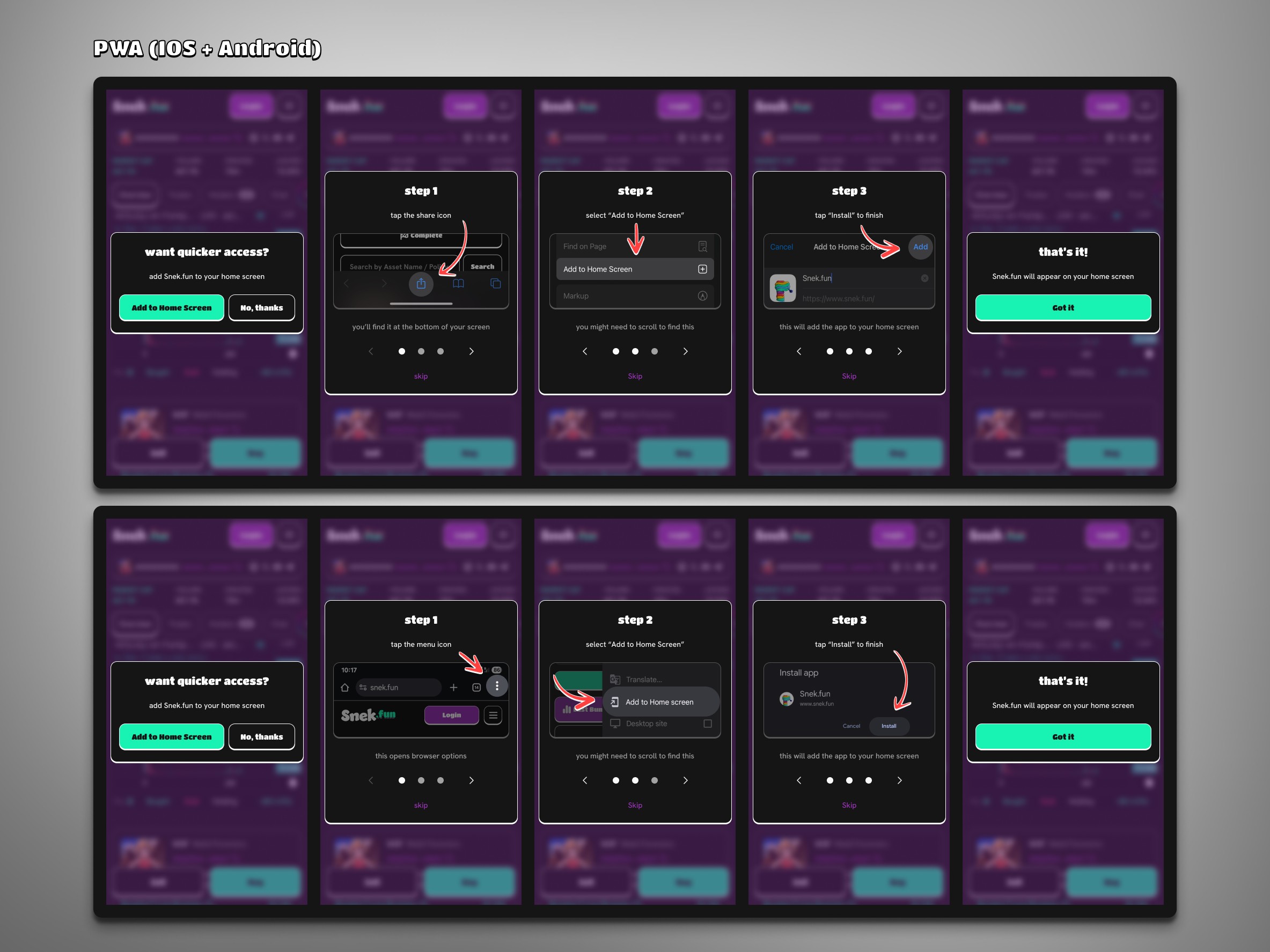
Designed PWA onboarding flow for both iOS and Android.
Showcases attention to cross-platform user experience and product accessibility beyond standard web and mobile layouts.
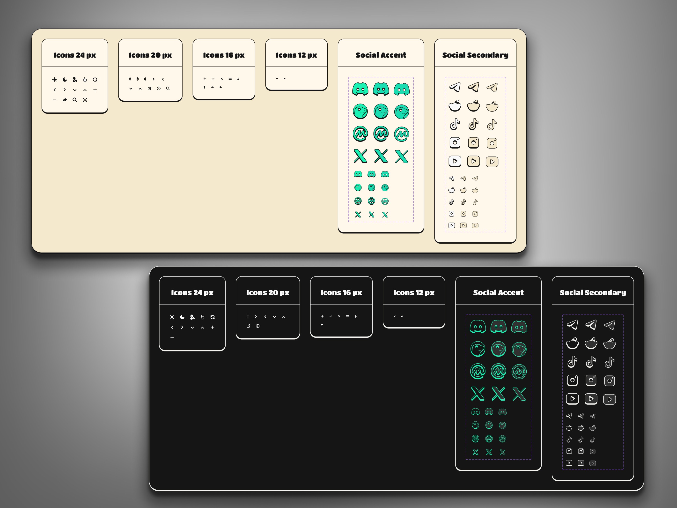
Icon System - Scalable & Themed Assets
Created consistent icon sets across light/dark themes and multiple sizes to maintain visual harmony.
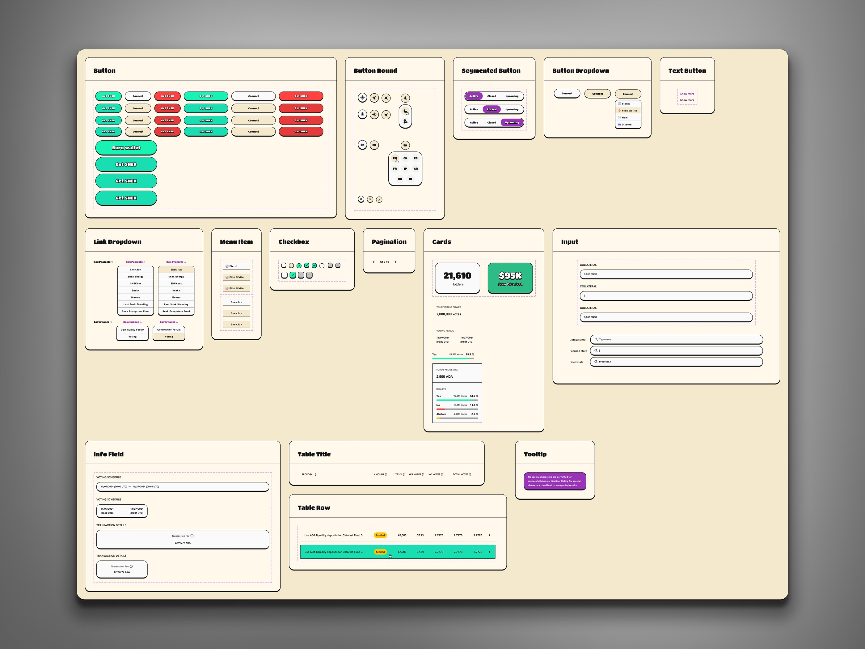
Component Library - Modular UI for Scalability
Reusable component system with tokens for faster, consistent UI development.
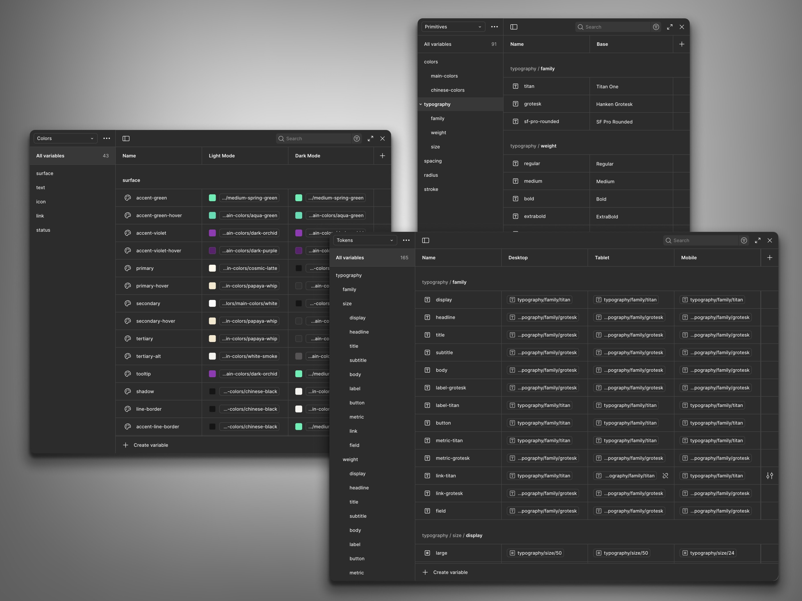
Design Tokens - Unified Visual Language
Defined tokenized variables for color, typography, and spacing to ensure consistency across devices and themes.

Systemized Design Workflow
Organized Figma setup with tokens, components, and documentation for smooth collaboration and implementation.
Success Validation
Since the product was designed from scratch, we defined clear success criteria before implementation - readability, task clarity, and flow completion without errors.
Usability testing showed that users could complete governance voting flows 20–25% faster than the initial benchmark
Early QA feedback confirmed that input validation and edge cases reduced user confusion during trading.
Internal team reviews validated the clarity of hierarchy and theming across both light and dark modes.
Developer handoff was completed with zero design revisions, confirming the efficiency of the design system.
Outcomes
Delivered a complete, multi-theme design system with over 80 reusable components
Improved clarity and data readability across trading and governance dashboards
Designed scalable UX flows covering complex user scenarios, including wallet connection, onboarding, and PWA integration
Ensured smooth handoff and implementation through developer-ready Figma files and clear documentation


